Value/frequency charts
Frequency charts summarize data sets by showing how often each data point appears within a set. This can be displayed as either a table or a graph. Questions about these charts will generally focus on the mean/median of the data set.
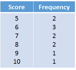

Students should be comfortable calculating the mean/median from either of these two types of charts. Like other mean and median questions, ACT questions will often ask about what would happen to the mean/median of the data set if a new number was added or if a previous number was changed.
Leave a Reply